Seasonal Color Palettes for Spring Knitting and Crochet Projects
Spring is the season when many of us want to cast on something light. The heavy wool pullover that carried us through January suddenly feels like too much, and our hands reach for skeins in softer, fresher shades. But choosing a spring palette is not simply a matter of buying pastel yarn and hoping for the best. The colors need to work with the textures you enjoy knitting, with the amount of time you realistically have, and with the clothes you will actually wear once the weather turns. This guide walks through a few seasonal palettes worth trying, the yarn textures that suit them, and simple project ideas that make the most of both.
Why Spring Palettes Behave Differently
Color looks different depending on what surrounds it and how the fiber reflects light. A dusty pink in a smooth merino reads as soft and elegant; the same pink in a fluffy mohair blend becomes almost weightless, floating in and out of focus. That is why a palette that looks lovely on a mood board can disappoint once it is worked up.
Spring light is also cooler and more diffuse than winter light. Colors that felt rich and enveloping in December can look washed out in April. If you are drawn to pale shades, choose ones with a little depth or a hint of grey rather than pure, bright pastels. A sage green holds up better than a mint; a muted coral reads warmer than a bubblegum pink. Test your candidates by holding two or three skeins together in daylight near a window, not under a lamp. Then drape them over your forearm and step back. If one color disappears entirely against the others, it will probably disappear in the finished fabric too.
The Four Palettes Worth Trying This Season
1. Meadow Neutrals
Start with a base of oat, ecru, and pale stone, then add sage, soft moss, and a single deeper green such as pine. This is the palette for anyone who loves natural, understated color but wants something more interesting than plain beige. It works beautifully in textured stitches, because subtle tonal differences show up in cable crossings and bobbles without shouting.
Texture pairing: a smooth DK or worsted in the neutrals, with one skein of a slightly slubby or tweeded yarn in the green for contrast. Avoid very fluffy yarns here; the point is definition.
Project idea: a textured cowl worked in the round, with the neutral as the main color and two narrow green stripes near the cast-on edge. Or a set of washcloths in a basketweave stitch, which is a good way to try the palette cheaply before committing to a larger piece.
2. Blush and Clay
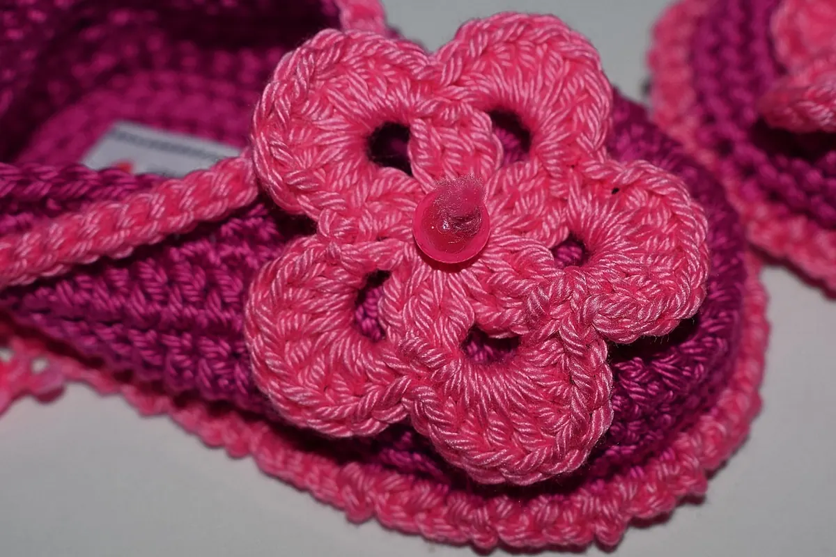
Warm pinks, terracotta, soft rust, and a grounding chocolate brown. This palette is warmer than most spring collections suggest, and that is exactly why it works. It flatters a wide range of skin tones and does not look babyish, which is the risk with pink-heavy schemes. Keep the pinks dusty rather than sugary.
Texture pairing: plant fibers shine here. A cotton-linen blend in blush next to a matte cotton in clay gives a dry, summery hand that suits the colors. If you want softness, a merino-silk blend in the pink makes a lovely contrast to a crisper cotton.
Project idea: a simple rectangular wrap in alternating stripes of blush and clay, finished with a brown crochet border. For crochet, a granny-square bag in three of the four colors, with the brown used only for joining, keeps the palette from turning muddy.
3. Sky, Chalk, and Ink
Pale blue, off-white, and a deep navy or near-black. This is the crispest of the spring palettes and the easiest to wear with denim. It reads clean and slightly coastal without tipping into nautical cliché, provided you keep the blue soft rather than electric.
Texture pairing: smooth, well-twisted yarns. A tight cotton or a smooth superwash merino lets the contrast between chalk and ink do the work. Save the halo for a single accent skein if you want one at all.
Project idea: a lightweight tee or short-sleeve top in chalk with narrow ink stripes. If you crochet, try a mesh market bag in sky blue with an ink base; it is quick, useful, and shows off the palette in a small format.
4. Sherbet Accents
Some knitters want color, and spring is a fine time to use it. Build a neutral base, then add one or two brights: apricot, lemon, watermelon, or a clear turquoise. The trick is restraint. Two brights plus one neutral is usually enough; three brights start to compete.
Texture pairing: keep the brights in smooth yarns so they stay vivid, and let the neutral carry the texture. A fluffy cream aran paired with smooth bright DK for stripes or edging works well.
Project idea: a striped baby blanket, or a pair of socks with a bright contrasting heel and toe. Socks are the ideal place to experiment, since a single 50 g skein goes a long way.
Matching Texture to Color
The relationship between color and texture runs both ways. Halo softens color; stitch definition sharpens it. A few reliable rules:
- Fluffy yarns (mohair, alpaca blends, brushed wool) mute and blend colors. Use them for tone-on-tone palettes where you want a gentle wash of color rather than clear stripes.
- Smooth, tightly spun yarns keep colors distinct. Choose them when your design depends on crisp contrast or fine colorwork.
- Slub and tweed yarns add flecks that break up flat color. They suit earthy palettes and hide small mistakes in plain stockinette.
- Plant fibers (cotton, linen, hemp) look matte and dry. They make warm palettes feel summery and keep pale shades from looking precious.
- Shiny yarns (silk, viscose blends) intensify color. A little goes a long way; use them for accents, trims, or a single luxurious accessory.
One practical note: always knit or crochet a swatch, wash it, and look at it in daylight. Cotton in particular can look quite different after blocking, and pale colors sometimes bloom or grey out once the fabric relaxes.
Planning a Coherent Spring Project
Before you buy, decide what role each color plays. A workable approach is to assign one main color (roughly half the total yarn), one supporting color (a third), and one accent (the remainder). This keeps striped and colorblocked projects balanced without overthinking it.
- Choose the project first, then the palette. A lace shawl and a chunky cardigan need different color strategies.
- Pull three to five skeins from your stash or a shop shelf and photograph them together in daylight.
- Check the photo in black and white. If the values are too similar, the pattern will look flat from a distance.
- Buy all the yarn for the project at once where possible, and check dye lots, especially for neutrals.
- Swatch in the stitch pattern you will actually use, not just stockinette.
If you are working from stash, this is a good moment to sort by color family rather than by weight. You may find that last year's leftover skeins already form a palette you like.
A Few Closing Tips
Spring projects tend to be smaller and faster, which makes the season ideal for experimenting. Try a palette in a hat, a pair of fingerless mitts, or a set of coasters before committing to a garment. Keep notes on which color combinations pleased you and which fell flat; a small notebook or a photo folder saves a lot of second-guessing next year.
And do not feel obliged to follow the pastel convention. If deep greens and warm browns are what you reach for in March, knit them. The best seasonal palette is the one that makes you want to pick up your needles or hook today and keep going tomorrow.
Photo: Sami Aksu / Pexels
Summer Crochet: Lightweight Yarn Choices for Breathable Tops and Bags
A practical guide to choosing cotton, linen and summer blend yarns for crocheted tops and bags, with notes...

Local Italian Mill Yarn: Why Small-Batch Wool Offers Unique Texture and Color
Small-batch yarn from Italian mills behaves differently from mass-market skeins: how texture and colour...
About Us